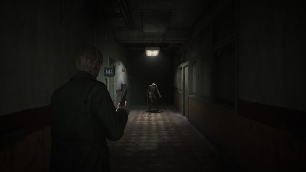
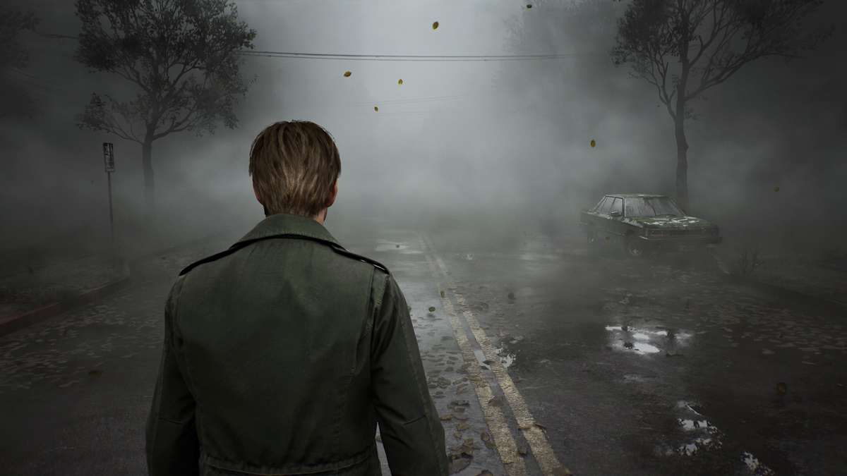
The makers of the Silent Hill 2 remake have announced that the game will not only ship with a grainy ’90s filter, but it also includes an option to dunk the UI completely for that sweet nostalgia factor. Granted, a toggle to drop the UI isn’t exactly innovation defined. But it should increase the spooky immersion of the horror game.
Bloober revealed the options earlier today on its social media channels. I’ll be the first to say that the tiny screens on X/Twitter and Instagram don’t really do the footage much justice. But take it from someone who spent the last 40 seconds with their face against the monitor, the filter does give the video an eerie quality. Or maybe that’s just the poor encoder? Feel free to make the judgment yourself:
Nodding along to the horror song
Bloober Team went on to explain that the lack of the UI means you’ll have to rely on other elements for your survival.
“Without UI, player guidance will naturally be directed by the game’s visuals, sound effects, and James’s behavior,” Bloober wrote in reply to the video. “He will glance towards important spots and have different animations and facial expressions during wounded states.”
Will this all be enough to intrigue wary fans of the original? Possibly. As someone who played the game many years ago, I do feel the remake is on the right path. Others seem to agree, despite prevalent concerns over its development.

I won’t pretend that there hasn’t been a healthy amount of critique surrounding Bloober Team’s upcoming remake of Silent Hill 2. Authenticity is important to fans of the horror masterpiece, and the developer is no doubt feeling the pressure. The efforts the team has made to create a remake fans and Bloober can be happy with seem clear, at least as far as aesthetics is concerned.
We’ll know for sure if the Polish developer can nail its biggest project yet when the game launches next month.


