[The uncanny valley debate is something that continues to go on, and Tron’s got a nice point here with his GTA 4 argument. I’d certainly love to see the game cel-shaded, as the appearance of the game is something that really turns me off to buying it. It’s just not appealing anymore. Enjoy the post, all! — DMV]
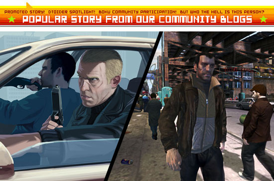
A conflict of two styles. Which do you think looks “better”?
How you answer this question detirmines what side you are on in the “good graphics” debate. Do you see good graphics as whatever is closest to replicating the looks and actions of real human beings? Or do you see good graphics as those that are easy on the eyes, sending a clear message while remaining visually interesting?
I think that Grand Theft Auto IV should employ the cel shaded look. The in-game graphics shown so far for the game are ugly as hell — far uglier than anything seen previously in the series. Sometimes too much detail and a near miss at realism is far worse to look at than the more rudimentary alternative. This isn’t only true in video games, but in all forms of visual art.
Let’s look to Mike Mignola’s Hellboy as an example:

On the left is the proper Hellboy — Simple. Expressive. Genuine. On the right is a broken Hellboy, from the game shown at E3. Overly detailed. Lifeless. Fake.
Mignola’s Hellboy is punk rock. Punk rock is music by guys who weren’t trying to play any better than they could. They embraced what they could do and they did it. And the fact that they did it with such passion, such expression, made it “work”. If they had applied their same technical skill to trying to play another band’s style of music, like the Beatles, they would have sounded like crap. All their mistakes would stand out like farts in a Christmas Carol.
The first GTA IV image is punk rock. The second is a punk rocker trying to sound like the Beatles. It’s a fart sound in the middle of “Silver Bells”. It’s a video game attempting to look like a movie with real actors. And it’s failing. Hard.
You’ve all heard about the Uncanny Valley by now. If not, here’s a wiki link and a link on how it applies to video game graphics. This theory is a big deal. It could in part explain why (despite all critics and hard core gamers predictions) the DS beat the PSP, and why as of today the Wii and the PS2 are the the best selling home consoles in the world. It’s not just price or the “gameplay innovations”. It’s because for a lot of people (not just kids), simple graphics area actually better to look at.
If Rockstar is smart, they will throw a cel shaded filter all over GTA IV before it’s delayed release next year. They will see that the Uncanny Valley Liberty City of GTA IV is much less appealing and more alienating than the city and characters of GTA III. They will accept that right now, games cannot achieve graphics that climb out of the Uncanny Valley, and that they may not for a long time. And personally I don’t think there is anything wrong with that.

Take another look at how awesome GTA IV would look with the cel shader. It’s beautiful, expressive, and emotionally real. I hate to be a graphics whore, but cel shaded GTA IV looks like a work of art, like a painting. I’ve always thought that the least tacky thing about GTA was the production art, and with a cel shader that production art can come to life. Simply incredible.
Regular GTA IV makes me feel nothing. It’s like looking at a crappy puppet show. It’s like looking at a bad actor wearing an ugly mask in an Alan Smithe movie. It’s like looking at a cheap commercial for an art school’s CGI department.

“In just four years, you too could be making video games instead of just playing them!” Yeah, games that look like total garbage, with plastic skinned characters covered in pock marks.
Anyway, it’s something to think about, eh Destructoid? What are the future’s “good graphics” going to be? Will we see a continuing push for photo realism, or a continued move towards non-realistic uses of CGI ? Right now things are simultaniously going in both directions, and I figure the one that makes the most money will be the “winner”.
If tv and movies can be used as a predictor for where games will head, games in the coming years will have less and less focus on realism. In the late 90’s and early ’00’s, there were tons of cartoons, commercials, and short animated films attempting photo realism with CGI. Then around the failure of Final Fantasy: Spirits Within, the entertainment community as a whole realised, “Wait, realism is not what CGI is for. That’s why we have actors. CGI is best for what we’d used to use puppets, stop motion, and 2D animation for. Except CGI looks awesome”.
Now the only CGI characters you see in movies are virtual stunt doubles or monsters that in past movies like Clash of the Titans and The Voyage of Sinbad were only possible with stop motion animation. In tv and commercials, CGI characters are always cel shaded, animate 2D in flash-esque style, or otherwise abstracted. No more attempts at realism.
Not until that James Cameron movie Avatar comes out, some day.
![]()
Rut Row.
But again, I digress.
Back to you, Destructoid. Where do think graphics will go from here? Where do you think they should go? You know where Tron Knotts stands. Where do you stand?


