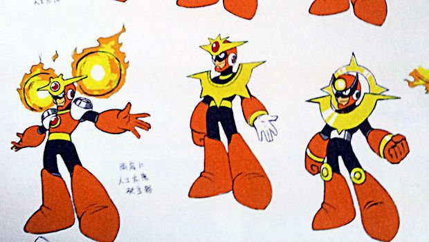
Some of these concepts are way better than the final design
The Mega Man Network has shared some Mega Man 10 robot master concept art from the R20+5 blowout book, and man is it interesting.
Most of these, I think, look better than the final designs. Some of them in particular are much more pronounced and interesting in the concept stage — for instance, Blade Man’s original idea of sharp edges jutting about his body, with more of a sense of regalia rather is much better than his final awkward Edward Scissor Hand arms design.
Some of them are probably better off without the concepts (even if Pump Man’s faucet chest still looks really stupid), as a few of them resemble former franchise Robot Masters a little too closely (the old one is totally Aqua Man!).
But as a general rule, I love these concepts.
Concepts unearthed [Mega Man Network]


