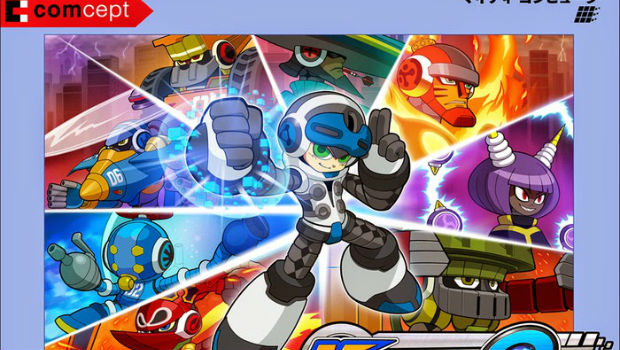
Japanese box art revealed
The Mighty No. 9 team has revealed a new design for their hero Beck, as well as a new Japanese box art design. Apparently Beck is going to be more white themed from now on, Director Koji Imaeda explains,
“From the very beginning we designed Beck to have a neutral, grey base, with the idea of wanting to make something completely new and unique. But development soldiered on, and as we approached the last leg, we started looking closer at Beck. As a protagonist that could absorb the abilities of his siblings and take on various forms, our image of his appropriate color shifted from neutrality to containing all possibilities, and since white is a combination of all colors of light, we felt that would actually suit his character better! Hence, we went with the coloring change.”
So there you go. Hopefully the finished engine will look a bit better than the demos so far.
Development update [Mighty No. 9]


