Videogame development is an iterative process, and games undergo countless changes along the way. In many cases, the final product bears little resemblance to earlier versions, as developers refine their vision and excise features that just don’t work.
Supergiant Games’ Bastion, one of my favorite games of 2011, is no different. It began life in September 2009, when designer Amir Rao and engineer Gavin Simon set out to build a playable prototype with which they could try to attract interest from developers and publishers.
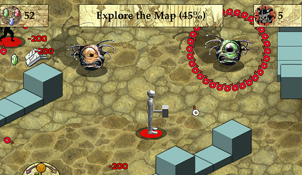
Four weeks later, they had something that looked like the screenshot above. Members of the Supergiant team brought the prototype to PAX East last weekend, and set it up for attendees to play — alongside the finished game that launched on Xbox Live Arcade last July. I spoke with Rao and designer/writer Greg Kasavin about what was and wasn’t in place after a month of development, what they kept and what they cut over the course of the next 20 months, and the places from which they cribbed the placeholder art.

Bastion features striking, gorgeous hand-painted 2D visuals, so it was quite a shock to see that it once looked… well, ugly. Rao explained that he and Simon wanted to quickly put together a playable version of Bastion that would “nail the gameplay feel” they wanted to deliver. The graphics consisted of placeholder art: the collectible gems were Zelda rupees, and the enemies were monsters that Rao and Simon had basically “scanned out of D&D books.”
It may not be obvious from the screenshots here, but one of Bastion‘s hallmarks — a game world that forms around The Kid as he moves — was already in place at that stage. Part of the reason, Rao revealed, is that “you never see the sky” in isometric games. Supergiant didn’t want to completely obscure their sky with a never-ending floor for The Kid to walk upon.
Bastion‘s artist, Jen Zee, didn’t start contributing to the project until March 2010; she officially joined the team in June, and things came together rather quickly from there. Supergiant made a big splash a few months later with Bastion‘s first public appearance at PAX Prime 2010, where the studio showed a build that looked and played very much like the final version.
Supergiant designed the prototype to show people how Bastion would play, not look. The final game’s enemies, for example, didn’t resemble the hideous ogres you see above. But many of them behaved in much the same way as in the first playable version. The prototype’s “mud man” monster, for example, threw out puddles of mud that harmed our hero. They morphed into the Scumbags that ooze blue goo and spew it toward The Kid.

Four weeks in, Bastion featured some of the sound effects and music that shipped with the final game. Audio director Darren Korb, a childhood friend of Rao’s, had already begun composing Bastion‘s terrific, award-winning soundtrack. However, narrator Logan Cunningham had not yet lent his gravelly voice to the character of Rucks. And as essential as Bastion‘s story ended up being, the only fragment that existed at the time was the idea of “returning to the Bastion” once the character collected enough gems and explored enough of the world map.
The team eventually got rid of those elements. Rao said that Supergiant didn’t want to force players to visit every single tile of the world or grab meaningless collectibles. In fact, the prototype lied to players, telling them they were done exploring as long as they got above 90%; even early on, Rao and Simon recognized that hunting for the last few undiscovered tiles was no fun. They also experimented with an unusual method of conveying health, with a red circle beneath the player character that filled up as he took damage. Bastion simply features a health bar — as Kasavin told me, “Sometimes, the standards are there for a reason.”
But Rao and Simon’s crude prototype accomplished its aim. I spent five to ten minutes playing the early build, and the particular gameplay feel that Bastion eventually delivered was immediately apparent. While the gray, polygonal protagonist model slid around the world without a walking animation, he rolled out of danger much as The Kid eventually did, and his mallet dished out punishment like the Cael Hammer. When I wasn’t busting heads with my gray hammer, I fired arrows with something similar to the Breaker’s Bow.
The Bastion prototype that the studio showed at PAX East 2012 was a precocious child who grew up to become a Nobel laureate. In only four weeks, Rao and Simon had much of its design down pat, and 20 months later, a seven-person team at Supergiant released Bastion to near-universal critical acclaim. Here’s hoping more developers offer this kind of fascinating insight into the development process.


