Over the years, Magic The Gathering has had various joke sets featuring hilarious artwork. Those are marvelous, but this isn’t about them — it’s just not as fun when it’s intentional. This is not about cards whose artists sneaked in actually harmful depictions of problematic elements, either.
This is about cards with inexplicably hilarious artwork that somehow bypassed all supervision and got printed to the absolute bafflement of millions of fans. Some would say the cards below have bad artwork. I say that all honest MTG art is beautiful, and some of it deserves to be celebrated for its superior levels of weirdness.
Weakstone (Antiquities)
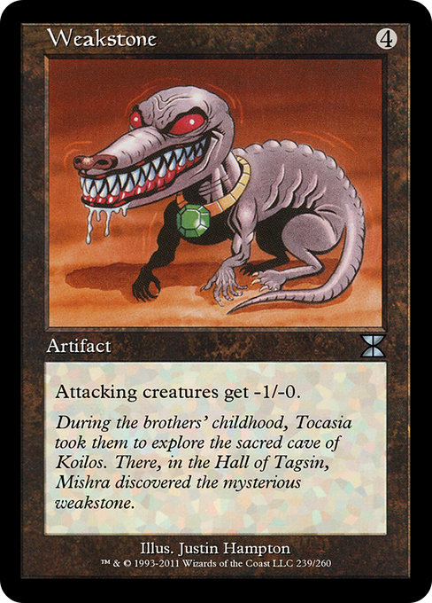
Let’s start with a not-too-egregious example.
Is that a dog? A crocodile? A crocodog? That’s not the point, because we all know MTG is home to much weirder creatures than this. The problem here — besides the fact that it probably shouldn’t have human-like hands — is that this looks like either an unfinished sketch, or MTG fan art that made it to print. It doesn’t even do a really great job of conveying the strange creature’s weakened state — just look at those buff and ripped arms! Those are by far the most detailed part of this image!
Amulet of Quoz (Ice Age)
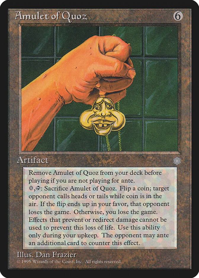
Interestingly, artist Dan Frazier put way more work into drawing the random hand holding the Amulet of Quoz than into drawing the artifact itself. The thing looks incredibly goofy, though that actually goes along really well with the card’s silly ability.
Remember the creepy Behelit from Berserk that Griffith uses to trade the lives of all of his friends to get unimaginable powers? This is its dumb brother, probably.
Giant Strength (Antiquities)
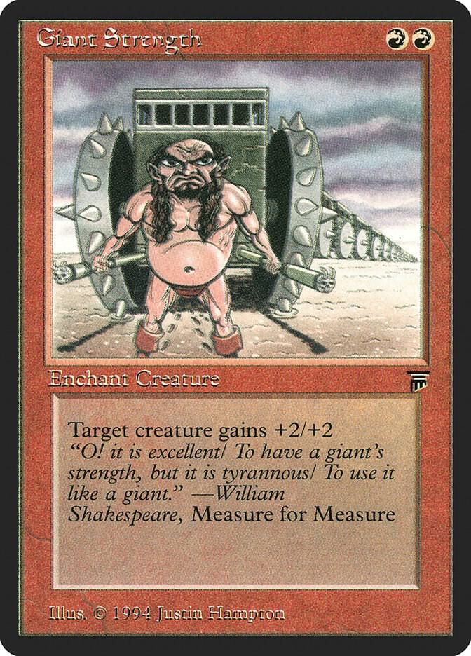
Ok, so I get it that it’s cool for a dwarf to become strong enough to pull one hundred heavy metal-looking carriages worth of nondescript rock and metal. But, if you think about it, having the carriages in the picture being also kind of small undermines this bit, doesn’t it? Ok, that’s all I managed to say about it before joking about the incredibly unflattering picture of this very hardworking creature. Giant Strength gets extra weirdness points for featuring flavor text by none other than William Shakespeare. Old MTG cards were just something else.
Idestructible Aura (Antiquities)
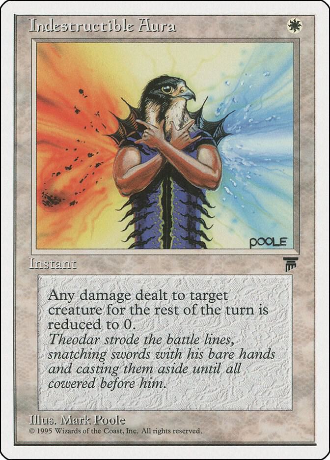
Is that a man wearing an animal mask – like King from Tekken, or the Hotline Miami crew – or is that a bird that made the dumb decision to exchange their wings for some human arms? I can’t find an answer to that question, and even that is likely easier to answer than whatever question about this creature’s strange chest that might arise.
Even though it looks incredibly dumb, I gotta give it to this card. When you’re such a heathen chimera but you still manage to strike a pose with that much confidence, then no one can deny that you really do possess an indestructible aura.
I have absolutely no proof to back me on this, but I decide to believe that this was the first instance of the birds with arms meme.
Reverse Polarity (4th Edition)
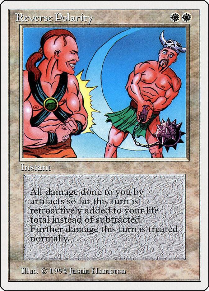
I don’t know if people who aren’t accustomed to video games will understand exactly what I’m talking about, but I’m damn sure gamers will. Do you know when you begin a conversation with a character before their textures are loaded? That’s what this artwork looks like, but it has been put to print back in ’94, so I don’t know how long I can keep holding my breath waiting for those textures pop up.
Flash (Mirage)
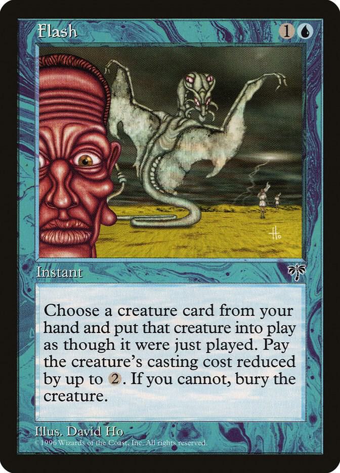
When it comes to straight up bizarreness, this card probably takes the cake for me because I cannot for the life of me understand what it is trying to show. Looking into the card’s description for help, we learn that “flash” is about putting a creature in play in an instant, likely when it’s not expected. Ok, so does that refer to the huge praying mantis-like thing that’s in the middle of the screen, or to the person who seemingly just popped up and is blocking the attempt at taking a picture of that huge cryptid?
Mold Demon (Antiquities)

I genuinely love this card’s artwork because I already find mold one of the scariest things in existence, and artist Jesper Myrfors managed to make it even more terrifying. It looks incredibly simplistic – childish, even -maybe to the point of raising suspicion that this was something bravely made by the artist’s young’s 4-year-old child when the father was bedridden due to actual mold-related allergies. Still, that’s exactly the amount of effort that the artwork of such an incredibly terrible creature deserves.
Sorrow’s Path (Dark)
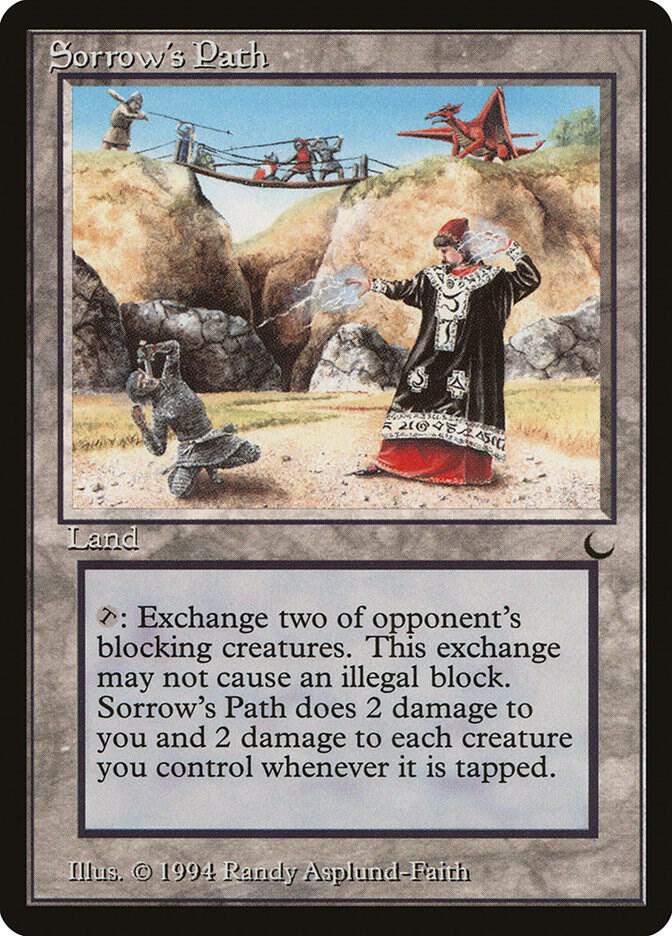
This is historically one of the most clowned-on cards in the history of the game. Sorrow’s Path is a legendary joke both for its utter uselessness and baffling artwork. I, for one, agree that the card itself sucks, but I actually respect the artwork choice a lot.
Staying true to the card’s ability, you absolutely cannot comprehend what the hell is happening — other than the wizard dude’s robe — which is clearly there to slay. I also love the dragon that’s sitting out the battle out of bafflement for the dumbass humans who decided that a bridge was definitely the best place to fight.
Unholy Strength (7th Edition)
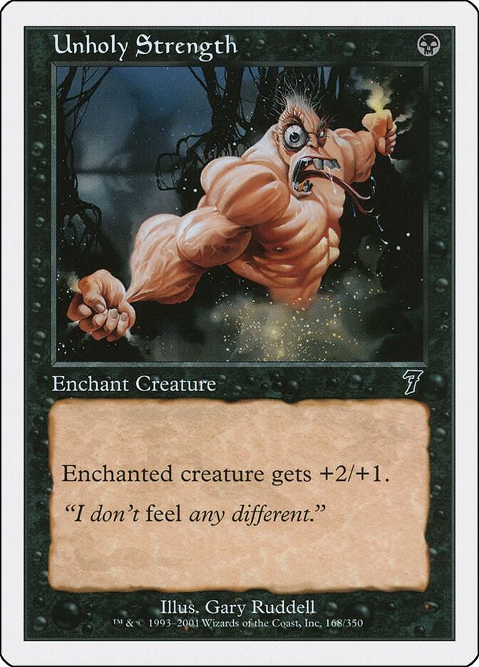
I really don’t think this one requires much in the way of explanation. 7th Edition’s Unholy Strength is one of the most off-putting depictions of a human body in the history of the game art, and one of the laziest ones as well. This makes Rob Liefeld’s most infamous drawings look like masterpieces. Yes, I mean it. Pay close attention, and you’ll realize that this thing has a mist in place of whatever body he should have below his waist. We don’t require full frontal nudity, of course, but this thing should at least have legs, otherwise no amount of strength will ever make him that intimidating. Even Liefeld doesn’t shy away from drawing anything other than feet.
Even worse, this isn’t the first, nor second, design for this card. Unholy Strength was already a staple of MTG at that point, and every other artwork is so much better.
Balduvian War-Makers (Alliances)
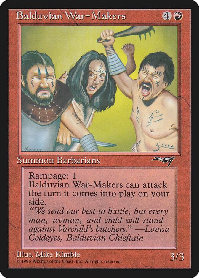
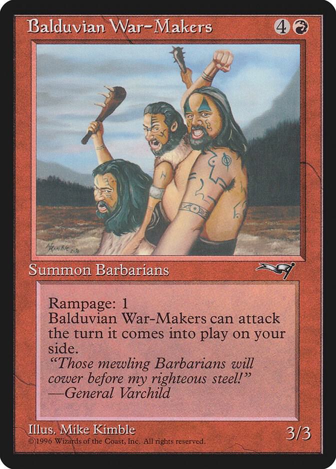
I’m sorry, but I just don’t feel very threatened by the Balduvian War-Makers. They look less like serious barbarians, and more like rotoscoped images of your average heavy metal concert-goers with weapons drawn in place of their beer bottles.
What makes this an all-timer for me is that this card has two different designs in the same set, and they both suffer from the exact same problem. Like, if I had to say something good about this, then I’d say props to the one on the right for at least having an actual background projected onto that green screen!
